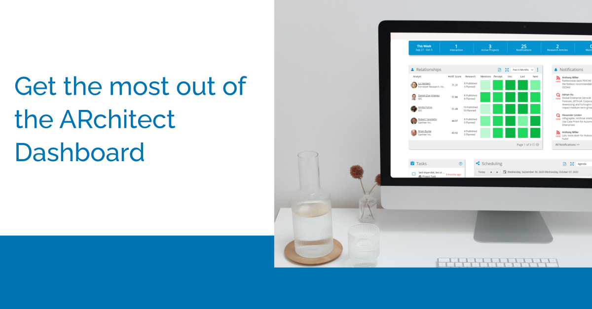
It’s almost been a year (wow!) since we launched the ARchitect Dashboard! We initially constructed the Dashboard to create a centralized place for you to perform key tasks, track your analysts and monitor your progress. Over the course of the year since the Dashboard’s release, ARchitect Users have shared their specific workflows to maximize the value of the Dashboard including discovering and tiering analysts as well as planning out your entire week from the Dashboard.
Follow along with the video to see our ARchitect experts talk through these workflows.
Scenario 1: You aren’t keeping track of your progress with either your tier 1 and 2 analysts so you are unsure on your next steps.
The Relationship Heat Map on the Dashboard is the best fit for tracking your progress with all of your analysts. You can filter the Relationship Heat Map with your Analyst Groups by clicking on the 3 blue dots at the right hand corner of the map. From there, you will find a filter manager that will let you select an analyst group. This allows for easy interchanging between analyst groups like your tier 1 and tier 2 analysts. If you don’t have an analyst group set up yet, find out how to set one up in our briefing book webinar. You can add Analyst Groups quickly and easily in ARchitect in just a few clicks. Once your Dashboard is set up with an Analyst Group, you can monitor your progress across all the heat squares and sort by the column headers. A common way to sort by is the Influencer Score, our analyst score that determines which analysts are generating the most buzz. Analyst mentions, perceptions, and interactions populate the Relationship section to give you an overview of where you need to adjust your efforts for each analyst. Hover over an analyst name to take direct actions from the dashboard like creating a briefing book, adding an interaction or perception, or following that analyst. The Relationship Heat Map is a great way to make sure you are hitting your targets with your tier 1 analysts but maintaining contact with your tier 2 by monitoring all activities.
Scenario 2: You are feeling overwhelmed with your planned meetings and can’t get a handle on what’s next.
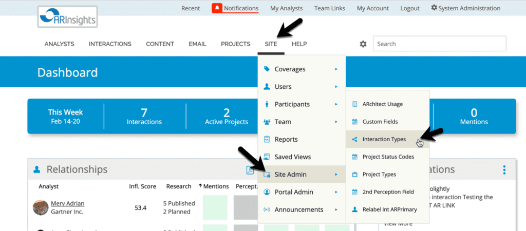
You can utilize the Scheduling, Notifications, and Tasks widgets to visualize what you are working on and what’s next. While the Relationship Heat Map shows your progress, the other widgets allow you to proactively view your AR plan. One interesting way you can use Notifications is by being updated on quotes from important analysts and utilizing those quotes to start conversations and briefings with analysts proactively. Being on top of what analysts are saying can give you an edge and build deeper relationships. To do so, click into those 3 dots and manage notifications to choose what information you would like to be updated on from which analysts. From there, you can choose how often you want to be updated with this information by email. The Scheduling widget and Tasks widget allow you to follow up on time and prepare for your next interactions. Utilize the Scheduling widget to visualize your meetings across the day, week, or month by selecting a view in the top right corner. You can even customize the color coding by requesting through your site admin or by going into the site admin section. Below is an image on how to get to that area.
Lastly, check off your to-do list directly from your Dashboard with the Tasks widget when they are complete. You can add a Task by hitting add Task at the bottom of any of your Interactions.